Status: Draft Published for comment
What is ‘Kitemarking’
Kitemarking is a (british english) term for quality assurance marking, so called because the original British Standard institute Verification (BSV) mark looks like a kite…
Many will be familiar with other quality assurance marks ISO, CE, UL, FSC…which are often seen stamped on consumer products or labels associated with them. SQF and BRC are Global Food Safety Initiative (GFSI) standards, ISO9001 is a standard certifying the way a company manages quality, customers and improvement.
Why Kitemark for Human Value
Where it is practical and achievable we should enable people to make choices based on the best available assessment of the impacts of those choices.
Quality assurance marking is an established way to signify some of the most important aspects of a product or service i.e., that it is safe, fit-for-purpose, that workers have been paid fairly, that trees or fish have been sustainably harvested, that animals have been treated humanely etc.
The proposed Human value kitemarking is a universal form of quality assurance labeling, By linking to the Value-Prospect App it can give access to expert opinion relating to all potential and probable impacts of the prospect. Highlighting and ranking those impacts that make the most difference to most people. Human Value impacts include but are not limited to, the safety and suitability concerns managed by existing quality and safety labels and certificates.
A Human value Kitemark takes up a very small space on a web page, much less than that required for ‘customer reviews’, or other labeling. It gives access to an entire independent knowledge bank, addressing issues of bias by balancing self serving promotion and manipulative advertising. It is free to use and provides participants with a way to learn, express themselves and engage in the human project.
What could a Kitemark look like
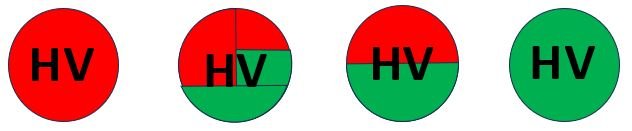
A small icon graduating e.g. from Red to Green depending on the Human Value Impact.
For discussion, I have shown four variants the (second) more complex version shows how the index could provide two comparisons. The left side comparing against e.g. general or alternative prospects and the right side comparing against closely matched equivallent prospects (this difference is explained later).
The discussion here is to platform the idea of a Kitemark.The best text, size, shape and colour for an effective Kitemark is to be determined, this one e.g. would be ineffective for some colour blind viewers.
The Kitemark as a Gateway
The human Value Kitemark is intended to be clickable, it could be displayed alongside an object being sold online.
Clicking on a the Kitemark when presented online e.g. besides a product being sold (like an electric car) would open up the Value Prospecting application (in a new tab) showing the relevant impact analysis. Note the app is designed to show a range of alternatives alongside impacts, showing other options ranked according to their overall human value impact assessments.
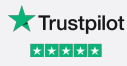
For an example of this sort of functionality, you might recognise this Trustpilot icon, which is occasionally seen just as a green star. Clicking on the icon opens up a company reviews but can also be used to leave reviews if the reader wishes…
How do we identify the prospect under consideration.
Let us assume that a unique Prospect Identity Code (PIC), will pre-exist for most established products and services, ie., that normally they will already have been assessed for the human value of their impacts.
New prospects can be fully impact assessed with an urgency and level of detail in proportion to their significance.
As a temporary measure for new prospects it would be useful to be able to approximate the PIC classification automatically using text descriptions (this is a software functional requirement)
The full Prospect Identity will combine (taxonomic) classifications as well as unique serialistion (potentially legal numbering – to allow adjacent insertions). Some classification fields may need to allow multiple ‘class memberships’ rather than mutually exclusive categories.
How do we identify comparable alternative prospects?
The classification component(s) of the Prospect Identity Code should be capable of defining related prospects. The Serialisation component (format to be determined) may also have this functionality e.g. it could be like e.g. a Dewey classification number (UDC is a better but less well known open alternative, whereas Dewey is proprietary/commercial/not publicly controlled)
How do we calculate the amount of Green/Red
The most obvious approach is to generate the proportion of green by comparing and normalising the human value outcome (i.e. the impact assessment) of the prospect with its peer group. This approach emphasises the most impactful options.
A very simple alternative approach is to make the kitemark green in proportion to the benefit/effort ratio of the prospect. A left and right sided kitemark could be constructed comparing the prospect benefit ratio of both a broadly and a narrowly defined peer group.
If users are being fatigued, by having to adapt to higher human value options all the time (such as during an environmental, climate and security crisis), it may be more effective to keep taking the choices which translate effort into effects efficiently, rather than being faced with options that are more impactful but effortful beyond that person’s current limit of reasonablilty.
Using the benefit/effort ratio emphasises the least disruptive/easiest actions the user can undertake to maximise human value, rather than the most impactful changes. Many sustainability options are for most people not effortful at all and highly effective. Many choices depend on the value each decision maker places on the wellbeing of others, a value similar to empathy.
switching the emphasis from most impactful to most efficient may be a viewing perspective that we wish to allow the user to select after being shown the most impactful.
The most effective colouring scheme is to be determined.
Comparison group example…Broad or Narrow?
Supposing our user is looking at cars. They may personally be inclined to consider a Broad or Narrow range of options (depending on the payoff). We should support and respect their choices.
At its simplest there can be a straightforward consumer choice. If the user is not prepared to consider giving up car ownership altogether then we only need to compare the narrow set of equivallent cars that they can afford including both borrowing to make long term ‘modern’ solutions viable, secondhand vs new options, and options from within their communities.
At another time this same user may be conflicted, considering global and intergenerational impacts, as well as wanting the convenience of a car. In this case we need a broader Prospect Comparison Set showing high human value outcomes resulting from e.g. giving up car ownership and using a combination of bike, public transport, rental, car share, co-ownership and family and commercial taxis…
In principle however the Prospect Value app must provide utility i.e., useful information relevant for the vast majority of users, whatever their perspective. So we should aim to include within the comparison groups, options that at least 95% of the general users will actually choose.
This range of ‘normality’ would encompass very diverse motivations and expectations. For example; Some would ‘need’ a utility vehicle to transport farm animals, work materials and tools, some for leisure activities, taking the family to and from events. We need a realistic non judgmental inclusive system recognising and respecting that the vehicle is also a status symbol (e.g. virtue, power, attractiveness) and can be a potent symbol of (new) agency and personal independence.
Customisation for individuals
Once the user has clicked on the kitemark and logged in. Then provided we display the difference between universal highest value approach and their own, we may wish to customise the options displayed to present those appropriate for their profile.
There is a tension/conflict between giving information that we know the user will not use (like a theoretical human value maximisation such as giving up car ownership) and tailoring the options offered to suit the specific user.
There is a risk when tailoring information – of presenting an ‘echo chamber’ by not displaying the choices with the objective best global and intergenerational human value outcomes. The Kitemark should ideally look the same for all users looking at the same prospect. However there are wide disparities in wealth and outlook worldwide, so some aspects of the Kitemark may need localisation or perhaps can present both outlooks at the same time..